Microsoft Excel - Conditional formatting

Learn about conditional formatting
Use a conditional format to help you visually explore and analyze data, detect critical issues, and identify patterns and trends.
THE BENEFITS OF CONDITIONAL FORMATTING
Whenever you analyze data, you often ask yourself questions, such as:
- Where are the exceptions in a summary of profits over the past five years?
- What are the trends in a marketing opinion poll over the past two years?
- Who has sold more than $50,000 dollars this month?
- What is the overall age distribution of employees?
- Which products have greater than 10% revenue increases from year to year?
- Who are the highest performing and lowest performing students in the freshman class?
Conditional formatting helps to answer these questions by making it easy to highlight interesting cells or ranges of cells, emphasize unusual values, and visualize data by using data bars, color scales, and icon sets.
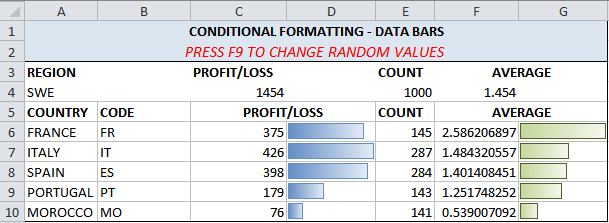
Click to download the
![]() example file, based on a table of values and data bars that change when you refresh the values (by using F9).
example file, based on a table of values and data bars that change when you refresh the values (by using F9).
A conditional format changes the appearance of a cell range based on conditions (or criteria). If the condition is true, the cell range is formatted based on that condition; if the conditional is false, the cell range is not formatted based on that condition.
Apply conditional formatting
By applying conditional formatting to your data, you can quickly identify variances in a range of values with a quick glance.
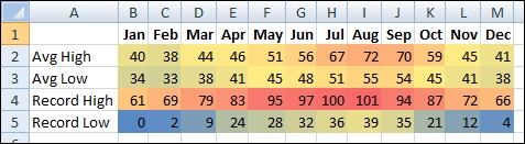
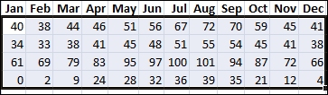
This graphic shows temperature data with conditional formatting that uses a color scale to differentiate high, medium, and low values. The following procedure uses that data.
How?
- Select the data that you want to conditionally format
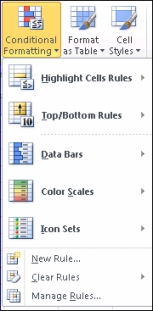
- Apply the conditional formatting
- On the Home tab, in the Styles group, click the arrow next to Conditional Formatting, and then click Color Scales.
- Hover over the color scale icons to see a preview of the data with conditional formatting applied.
-
Experiment with the conditional formatting
On the Home tab, in the Styles group, click the arrow next to Conditional Formatting, and then experiment with the available styles.

In a three-color scale, the top color represents higher values, the middle color represents medium values, and the bottom color represents lower values. This example uses the Red-Yellow-Blue color scale.
NEXT STEPS
After you have applied a style, select your data, click Conditional Formatting on the ribbon, and then click Manage Rules to manually fine-tune your rules and formatting.
Click to download the
![]() example file, based on a table of values and data bars that change when you refresh the values (by using F9).
example file, based on a table of values and data bars that change when you refresh the values (by using F9).