Microsoft Excel - Charts

Learn about charts
Charts are used to display series of numeric data in a graphical format to make it easier to understand large quantities of data and the relationship between different series of data. To create a chart in Excel, you start by entering the numeric data for the chart on a worksheet.
Click to download the
![]() example file.
example file.
Then you can plot that data into a chart by selecting the chart type that you want to use on the Insert tab, in the Charts group.
Excel supports many types of charts to help you display data in ways that are meaningful to your audience. When you create a chart or change an existing chart, you can select from a variety of chart types (such as a column chart or a pie chart) and their subtypes (such as a stacked column chart or a pie in 3-D chart). You can also create a combination chart by using more than one chart type in your chart.
GETTING TO KNOW THE ELEMENTS OF A CHART
A chart has many elements. Some of these elements are displayed by default, others can be added as needed. You can change the display of the chart elements by moving them to other locations in the chart, resizing them, or by changing the format. You can also remove chart elements that you do not want to display.
MODIFYING A BASIC CHART TO MEET YOUR NEEDS
After you create a chart, you can modify any one of its elements. For example, you might want to change the way that axes are displayed, add a chart title, move or hide the legend, or display additional chart elements.
To modify a chart, you can do one or more of the following:
- Change the display of chart axes - You can specify the scale of axes and adjust the interval between the values or categories that are displayed. To make your chart easier to read, you can also add tick marks to an axis, and specify the interval at which they will appear.
- Add titles and data labels to a chart - To help clarify the information that appears in your chart, you can add a chart title, axis titles, and data labels.
- Add a legend or data table - You can show or hide a legend, change its location, or modify the legend entries. In some charts, you can also show a data table that displays the legend keys and the values that are presented in the chart.
- Apply special options for each chart type - Special lines (such as high-low lines and trendlines), bars (such as up-down bars and error bars), data markers, and other options are available for different chart types.
APPLYING A PREDEFINED CHART LAYOUT AND CHART STYLE FOR A PROFESSIONAL LOOK
Instead of manually adding or changing chart elements or formatting the chart, you can quickly apply a predefined chart layout and chart style to your chart. Excel provides a variety of useful predefined layouts and styles. However, you can fine-tune a layout or style as needed by making manual changes to the layout and format of individual chart elements, such as the chart area, plot area, data series, or legend of the chart.
When you apply a predefined chart layout, a specific set of chart elements (such as titles, a legend, a data table, or data labels) are displayed in a specific arrangement in your chart. You can select from a variety of layouts that are provided for each chart type.
When you apply a predefined chart style, the chart is formatted based on the document theme that you have applied, so that your chart matches your organization's or your own theme colors (a set of colors), theme fonts (a set of heading and body text fonts), and theme effects (a set of lines and fill effects).
You cannot create your own chart layouts or styles, but you can create chart templates that include the chart layout and formatting that you want.
ADDING EYE-CATCHING FORMATTING TO A CHART
In addition to applying a predefined chart style, you can easily apply formatting to individual chart elements such as data markers, the chart area, the plot area, and the numbers and text in titles and labels to give your chart a custom, eye-catching look. You can apply specific shape styles and WordArt styles, and you can also format the shapes and text of chart elements manually.
To add formatting, you can use one or more of the following:
- Fill chart elements - You can use colors, textures, pictures, and gradient fills to help draw attention to specific chart elements.
- Change the outline of chart elements - You can use colors, line styles, and line weights to emphasize chart elements.
- Add special effects to chart elements - You can apply special effects, such as shadow, reflection, glow, soft edges, bevel, and 3-D rotation to chart element shapes, which gives your chart a finished look.
- Format text and numbers - You can format text and numbers in titles, labels, and text boxes on a chart as you would text and numbers on a worksheet. To make text and numbers stand out, you can even apply WordArt styles.
REUSING CHARTS BY CREATING CHART TEMPLATES
If you want to reuse a chart that you customized to meet your needs, you can save that chart as a chart template (*.crtx) in the chart templates folder. When you create a chart, you can then apply the chart template just as you would any other built-in chart type. In fact, chart templates are custom chart types - you can also use them to change the chart type of an existing chart. If you use a specific chart template frequently, you can save it as the default chart type.
How to create a chart
For most charts, such as column and bar charts, you can plot the data that you arrange in rows or columns on a worksheet into a chart. However, some chart types (such as pie and bubble charts) require a specific data arrangement.
Click to download the
![]() example file.
example file.
1.On the worksheet, arrange the data that you want to plot in a chart.
The data can be arranged in rows or columns - Excel automatically determines the best way to plot the data in the chart. Some chart types (such as pie and bubble charts) require a specific data arrangement.
2. Select the cells that contain the data that you want to use for the chart.
Tip - If you select only one cell, Excel automatically plots all cells that contain data that is adjacent to that cell into a chart. If the cells that you want to plot in a chart are not in a continuous range, you can select nonadjacent cells or ranges as long as the selection forms a rectangle. You can also hide the rows or columns that you do not want to plot in the chart.
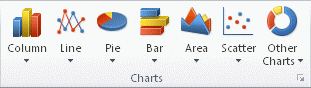
3. On the Insert tab, in the Charts group, do one of the following:
- Click the chart type, and then click a chart subtype that you want to use.
- To see all available chart types, click the symbol in the bottom-right corner to launch the Insert Chart dialog box, and then click the arrows to scroll through the chart types.
Tip - A ScreenTip displays the chart type name when you rest the mouse pointer over any chart type or chart subtype.
4. By default, the chart is placed on the worksheet as an embedded chart. If you want to place the chart in a separate chart sheet, you can change its location by doing the following:
- Click anywhere in the embedded chart to activate it.
- On the Design tab, in the Location group, click Move Chart.
- Under Choose where you want the chart to be placed, do one of the following:
- To display the chart in a chart sheet, click New sheet.
- To display the chart as an embedded chart in a worksheet, click Object in, and then click a worksheet in the Object in box.
This displays the Chart Tools, adding the Design, Layout and Format tabs.

Tip - If you want to replace the suggested name for the chart, you can type a new name in the New sheet box.
5. Excel automatically assigns a name to the chart, such as Chart1 if it is the first chart that you create on a worksheet. To change the name of the chart, do the following:
- Click the chart.
- On the Layout tab, in the Properties group, click the Chart Name text box. Tip - If necessary, click the Properties icon in the Properties group to expand the group.
- Type a new name.
- Press ENTER.
Notes
- To quickly create a chart that is based on the default chart type, select the data that you want to use for the chart, and then press ALT+F1 or F11. When you press ALT+F1, the chart is displayed as an embedded chart; when you press F11, the chart is displayed on a separate chart sheet.
- If you no longer need a chart, you can delete it. Click the chart to select it, and then press DELETE.